The short answer
Four aspect ratios cover almost every placement. 9:16 (tall portrait) is the full-screen format for YouTube Shorts, Instagram Reels and TikTok. 4:5 (shorter portrait) is the recommended ratio for Instagram Feed video ads and one of the ratios LinkedIn accepts for video ads. 1:1 (square) is accepted by LinkedIn and TikTok ads and counts as a Short when uploaded to YouTube. 16:9 (landscape) remains the standard for YouTube on a computer, and it is the shape of most broadcast masters. The numbers in this guide come from each platform's own help or ads documentation as published in November 2026. Platforms change these pages, so check the current version before a large production run.
Platform by platform, from the platforms' own specs
YouTube: its help page on video resolution states that the standard aspect ratio for YouTube on a computer is 16:9. The player resizes to fit other ratios and adds padding around a 9:16 video in a desktop browser, and YouTube advises against adding black bars to the file itself because that interferes with the player's resizing. YouTube Shorts: the help page for uploading Shorts from a computer says a Short can be up to 3 minutes long, with a square or vertical aspect ratio. A video wider than square is therefore published as a regular video. Instagram: Meta's Ads Guide lists 9:16 at 1440 x 2560 pixels for Reels ads, and 4:5 at 1440 x 1800 pixels, with a 1% aspect ratio tolerance, for Instagram Feed video ads. TikTok: the In-Feed ads specification recommends vertical 9:16 with a minimum of 540 x 960 pixels, and also accepts horizontal 16:9 (at least 960 x 540) and square 1:1 (at least 640 x 640). LinkedIn: the video ads specification accepts 4:5, 9:16, 16:9 and 1:1, with a maximum of 1080 x 1350 for 4:5 and 1080 x 1920 for 9:16, a 5% aspect ratio tolerance and a duration of 3 seconds to 30 minutes. Organic posting rules can differ from ads rules on the same platform, so a team that publishes both should keep the two lists separate.
If you can only make two versions
Not every segment justifies four exports. Read against the specifications above, a 9:16 version covers the full-screen vertical players on YouTube Shorts, Instagram Reels and TikTok, and is accepted by LinkedIn video ads. The original 16:9 covers YouTube on a computer, websites and the broadcast itself, and is accepted by TikTok and LinkedIn ads. A third version in 4:5 is worth adding when Instagram Feed ads or LinkedIn feed placements are part of the plan, because it is the ratio Meta recommends for Instagram Feed video ads. Square is the least demanding to produce from a 16:9 master, but it fills less of a phone screen than 9:16. Choose by destination, not by habit, and write the decision into the template so that every segment follows it.
Safe zones: the part of the frame you cannot use
A full-screen vertical player is not an empty canvas. Captions, account names, buttons and calls to action sit on top of the video. Meta's guidance for Reels ads suggests keeping at least 14% of the top, 35% of the bottom and 6% of each side free of text, logos and other key creative elements, so that they are not covered by the interface or cut off on screens taller than 9:16. On a 1920-pixel-tall frame, 35% is 672 pixels: a lower third placed where it sits in the broadcast will usually land under the caption and buttons. TikTok says its safe zone depends on the orientation, the length of the ad caption and any extra formats used, and publishes downloadable safe zone files for checking a creative. In practice that means two rules for vertical versions of broadcast content: move names, scores and key graphics towards the vertical center, and check every template against the platform's own overlay rather than a generic grid.
One master, several outputs
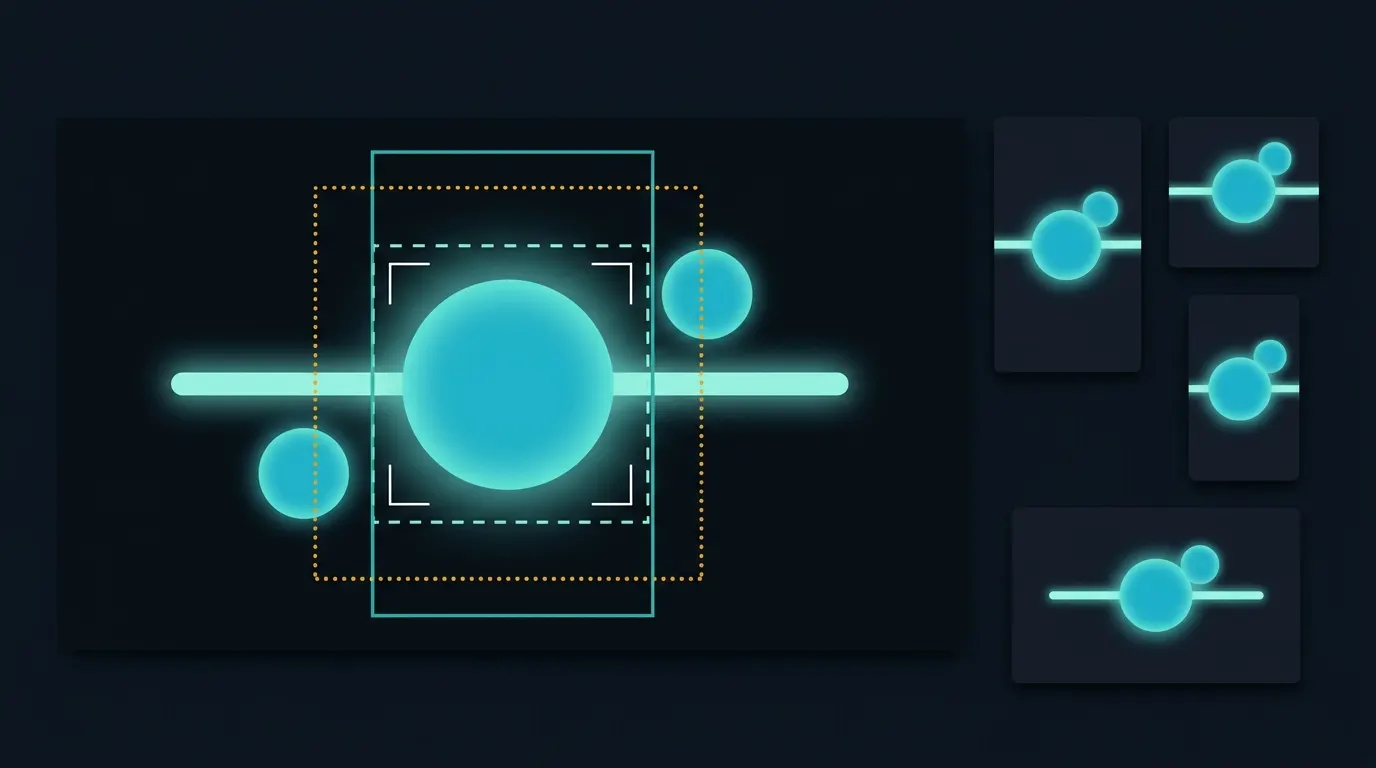
Most broadcasters and publishers start with a 16:9 master, typically 1920 x 1080. The geometry sets hard limits. A full-height 9:16 window inside a 1080-pixel-tall frame is about 608 pixels wide, roughly a third of the original width. A 4:5 window is 864 pixels wide and a 1:1 window 1,080 pixels wide. So a portrait version of a 1080p master contains about a third of the picture, and its native resolution is below the 1080 x 1920 that LinkedIn lists as its 9:16 maximum and the 1440 x 2560 in Meta's Reels spec; scaling it up does not recover detail that was never captured. Plan for this rather than discovering it in review: decide which outputs each programme needs, which part of each scene must survive, and whether a 4K source is available for segments where portrait quality matters. Keep one master and derive each ratio from it, with source timestamps attached, so that a correction to the master can be carried into every version.
Why broadcast footage needs more than a crop
A fixed crop works when one subject stands near the middle of the frame. Broadcast pictures rarely look like that. A news segment can show a presenter on one side and a map or footage on the other; a studio panel puts several speakers across the width; sports coverage combines play that moves across the frame with a scoreboard in a corner. A centered 9:16 window keeps about a third of the picture and will drop one of those elements. A tracking crop follows one subject but still shows a single window. Recomposition takes a different approach: it can place more than one region of the source into the new frame, such as a speaker above the graphic they are explaining. Minute-ly.com's Smart Composition is built for this step. It recomposes live or on-demand horizontal video into vertical, portrait, square and foldable outputs while keeping the important people, action and graphics in frame, with layouts and safe areas agreed for each workflow.
Checklist for a multi-ratio workflow
List the destinations and the ratio each one needs, separating organic posts from ads. Record each platform's documented resolution, tolerance and duration limits, with the date you checked them. Mark the safe zones for every vertical template, using the platform's own guidance or files. Decide for each shot type, such as presenter, two-shot, panel, full-screen graphic and wide play, what must stay visible in a portrait frame. Check that captions and burned-in graphics stay readable at phone size and clear of the interface. Avoid letterbox bars inside the file where a platform's player adapts the frame itself. Review every output on a real phone before publishing, and keep each derivative linked to its master so that corrections and rights information follow it.